January - November 2024
Building a digital showroom for Mercedes-Benz Vans UK
Lloyds Commercial Banking was historically a desktop-only platform designed for small, medium, and corporate businesses. To modernize the experience, Lloyds set out to create a secure mobile app that balanced business-critical functionality with ease of use. The goal was not only to bring key features to mobile but also to rethink authentication, onboarding, and interface design so businesses could confidently manage finances on the go.
Key contributions: Leading and executing MVP designs, research, facilitating workshops with the cross-functional team.


Project focus
While the project involved designing the full
e-commerce journey (from product listings to checkout), one of the most critical challenges was building a scalable design system to support future features and maintain brand consistency across teams.
Goals
Build a scalable design system
Create a modular, consistent design framework to support rapid development and future feature growth.
Enhance user confidence
Design cohesive, trustworthy digital experiences that reflect Mercedes-Benz’s premium brand.
Improve speed and efficiency
Enable faster delivery by providing developers with reusable components and patterns.
Increase online conversion
Optimize the digital journey to encourage more customers to complete van purchases online.
Establishing the foundations
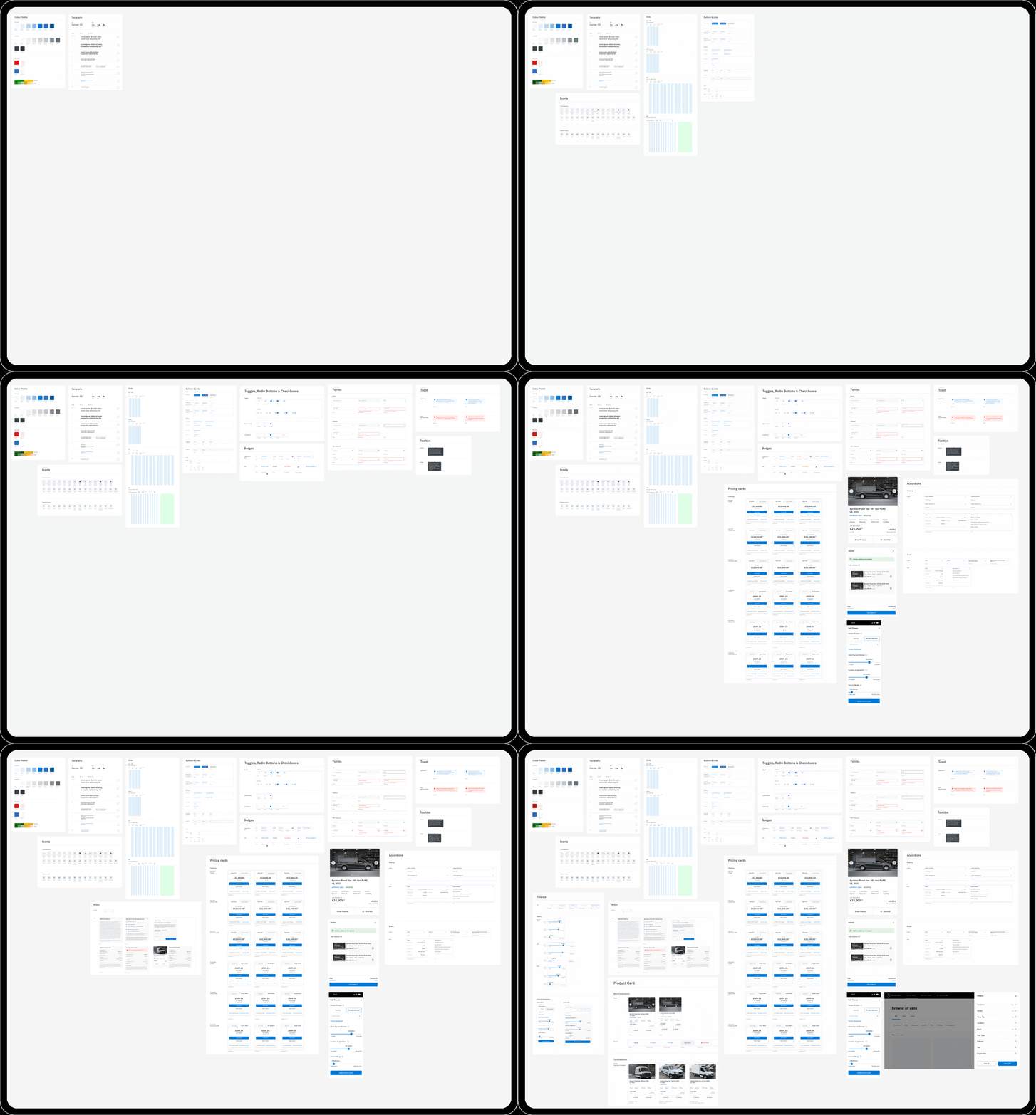
The old design system was messy and inconsistent. I audited it, identified pain points, and set principles for scalability, modularity, and using real data.
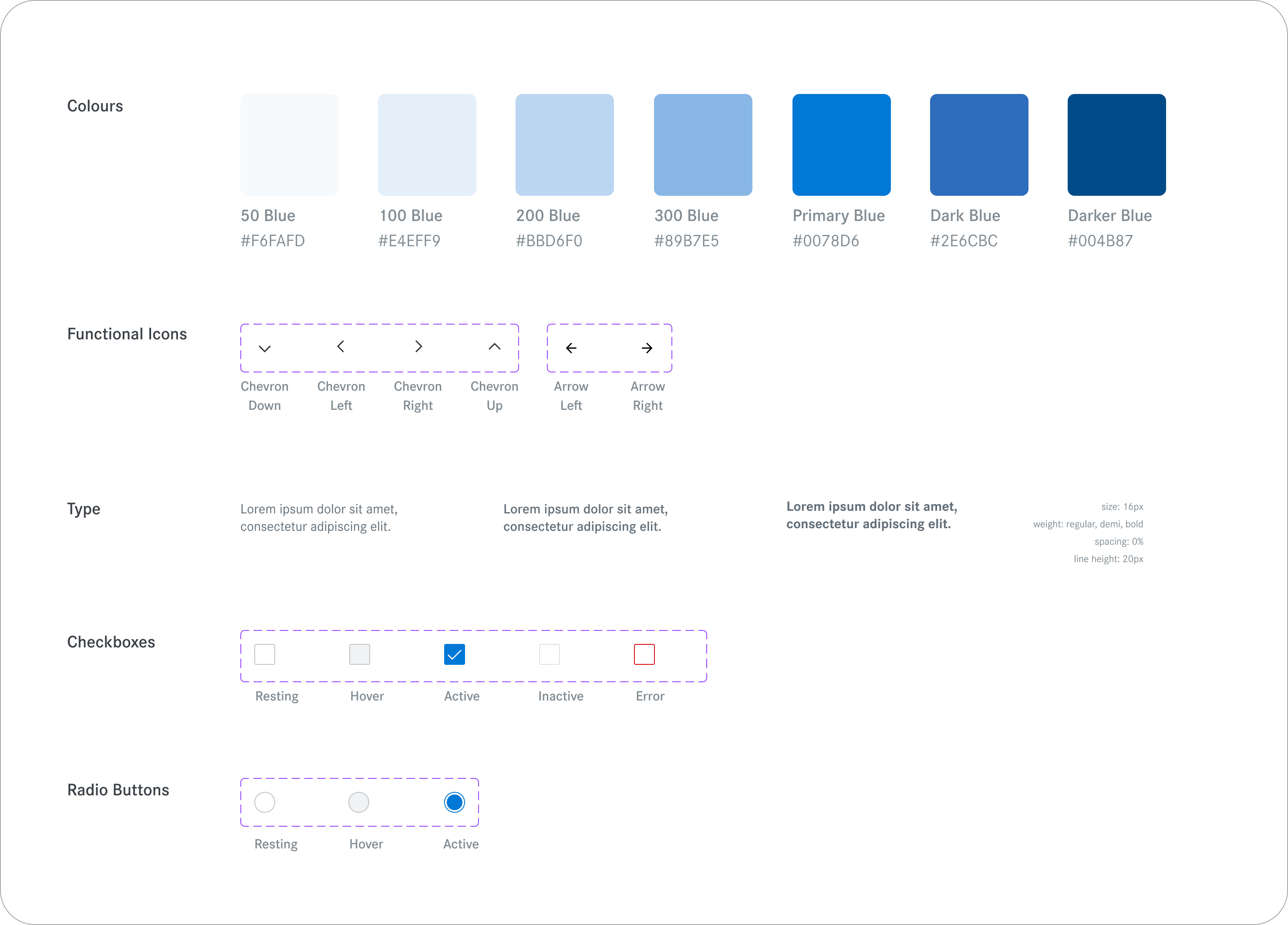
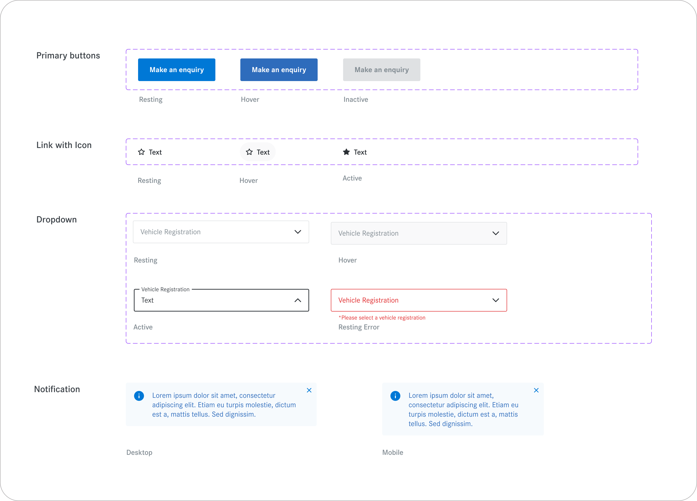
We built it atom by atom — colors, typography, spacing — then combined them into buttons, forms, and larger components, all the way up to templates and pages. Everything was responsive, covered different states, and with Figma variants, the team could easily mix, match, and reuse components while keeping everything consistent.
Design system impact
45% faster design delivery
Reusable components and templates cut design-to-development time nearly in half.
60% reduction in UI inconsistencies
Auditing and merging redundant elements streamlined the interface and reduced maintenance overhead.
+25% increase in online conversions
A clearer, more cohesive experience encouraged customers to complete their journeys online.
100% accessibility coverage across core components
Inclusive design principles were embedded into every element, ensuring compliance and usability for all users.
Building the purchase journeys
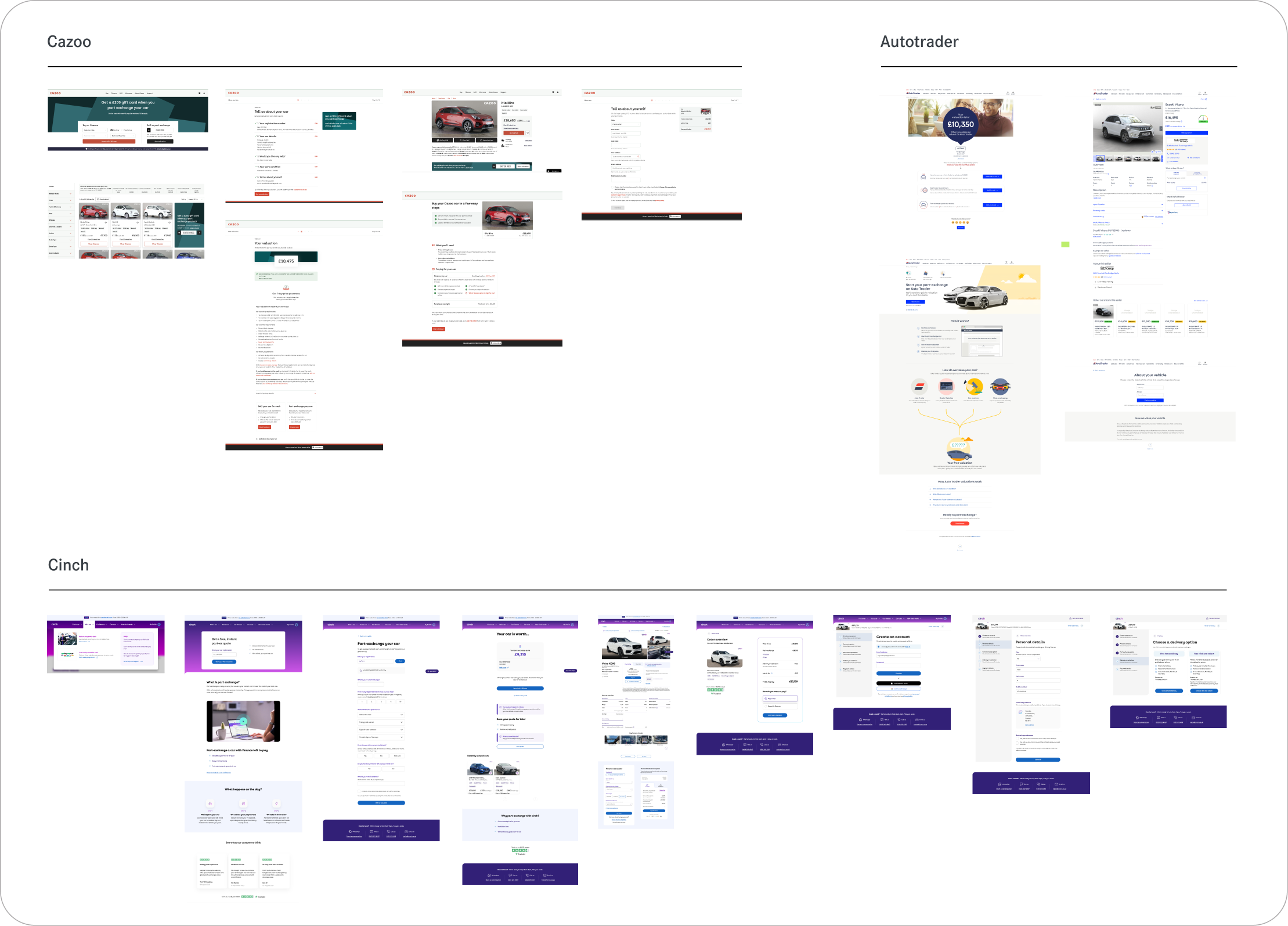
With the design system in place, we shifted focus to the full online purchase journey — from first visit to checkout. For each step, we started by reviewing the existing experience and running competitive analysis to see how other platforms helped users choose, compare, and commit.
This gave us a clear sense of what worked, what didn’t, and where we could reduce friction to support conversion.
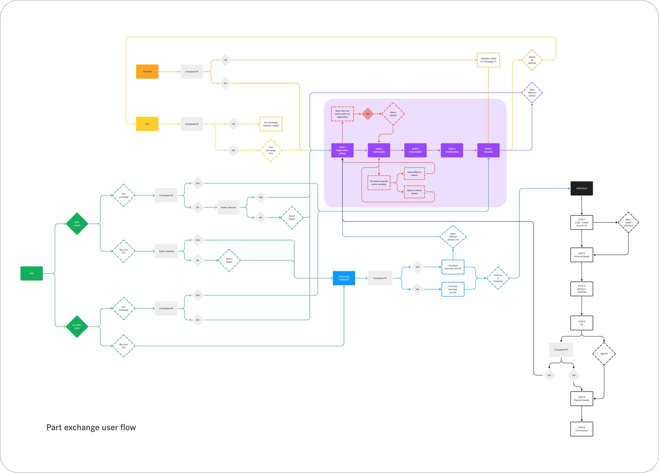
Crafting user flows
Next, we mapped user flows that made the path to purchase feel simple and reassuring. We worked closely with stakeholders to refine these flows, making sure users always knew where they were, what came next, and how close they were to completing their purchase — helping reduce drop-off at key decision points.
Multiple iterations
From there, we iterated heavily on high-fidelity designs, testing different layouts, CTAs, and content hierarchies to highlight pricing, finance options, and availability. Small changes — like clearer CTAs, better comparison cues, and upfront cost transparency — were deliberately designed to remove hesitation and increase completion rates.
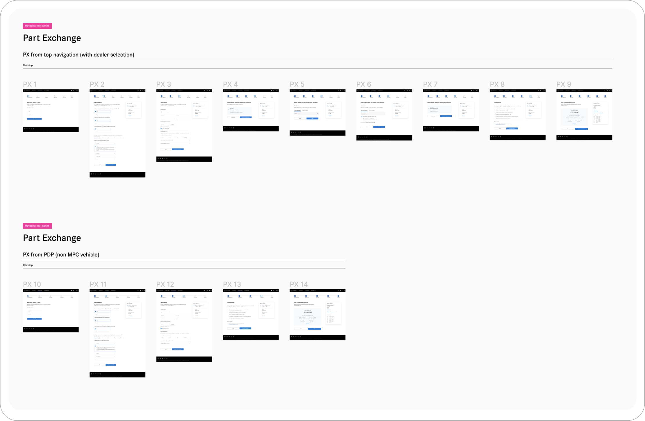
High fidelity design
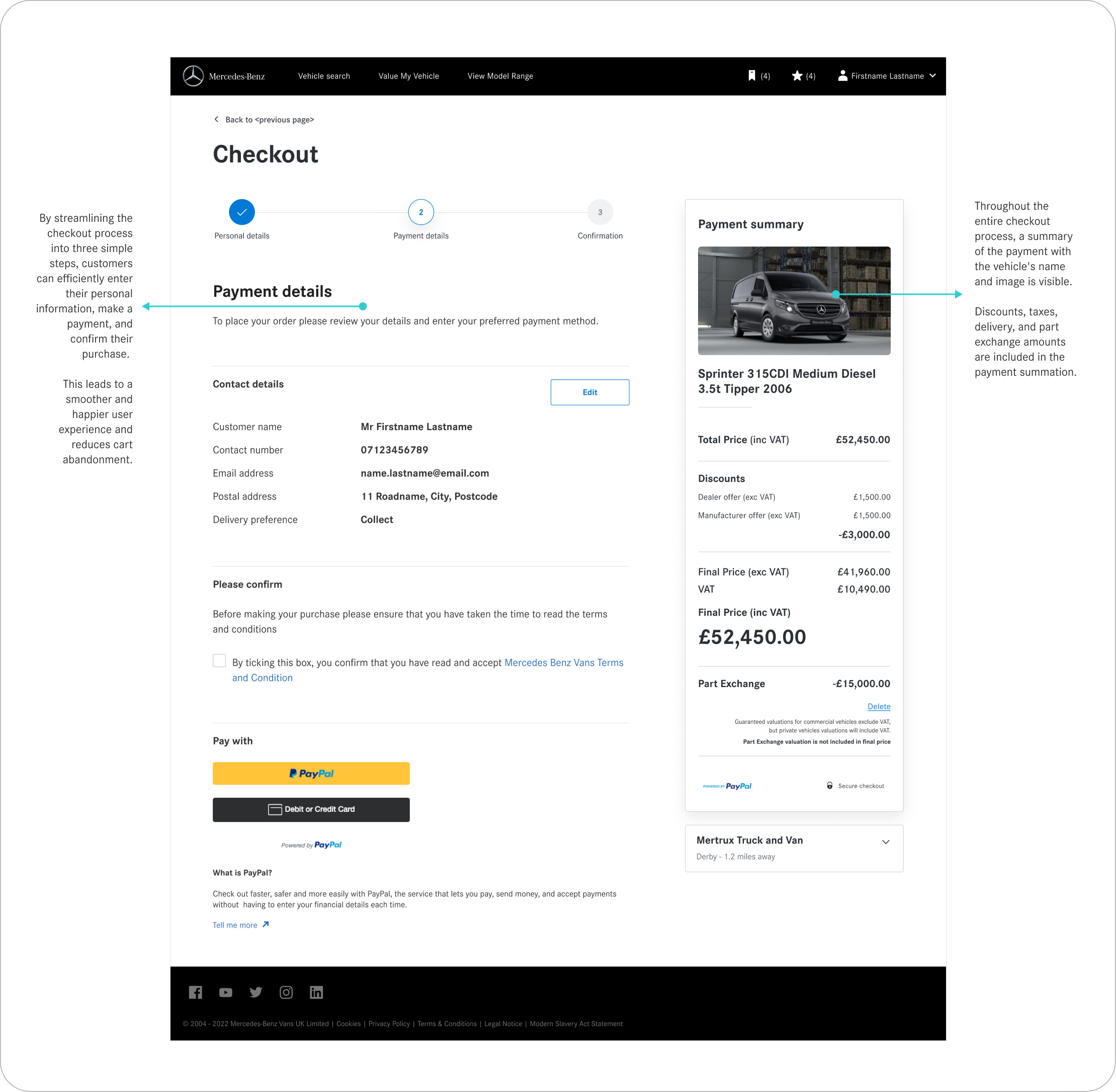
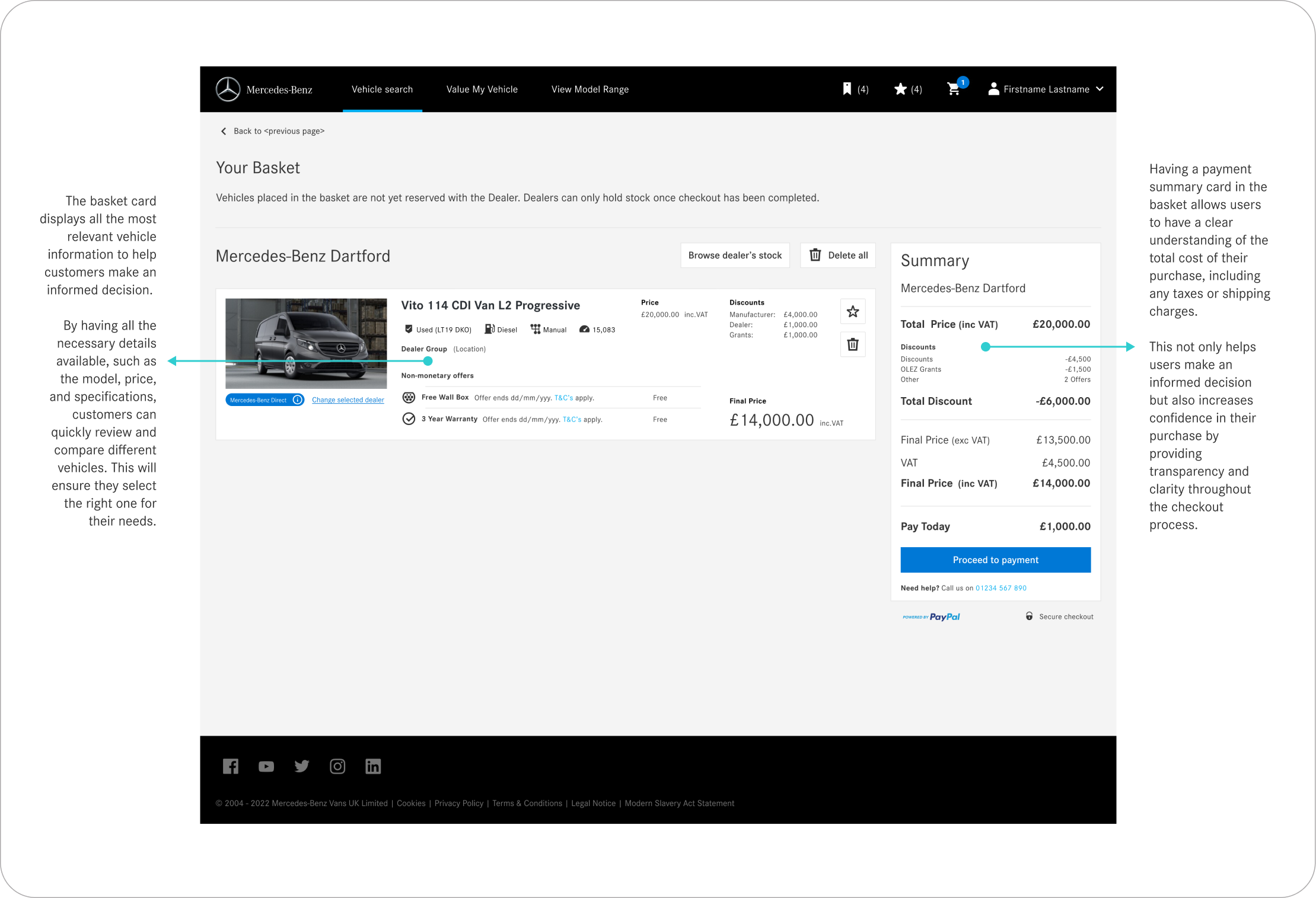
Finally, we delivered polished UI designs built entirely with the design system. From product listings and detail pages to basket, checkout, and part exchange, every screen was designed to build confidence and keep momentum going. This approach made it easier to introduce new features quickly, iterate safely, and continuously improve conversion without sacrificing consistency or brand quality.
Learnings
Scalability starts with structure
Establishing a strong atomic foundation allowed us to grow fast without losing quality or consistency.
Workshops build alignment
Collaborating closely with product, and engineering teams through workshops created shared ownership and accelerated decisions.
Real data, real results
Designing with production data early revealed edge cases and ensured that components worked in real-world scenarios.